website minification
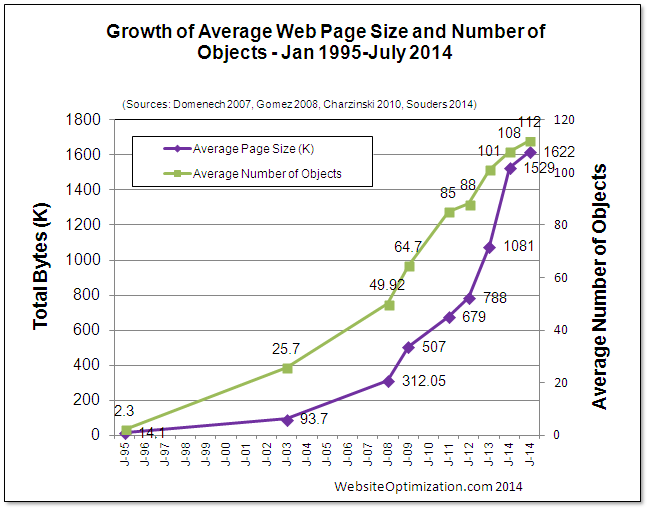
 I wanted to cover off some interesting work I’ve been doing with website minification that I wanted to share. The size of the average web page (top 300,000 websites) passed 1600K for the first time in July. We’re cramming more images and html into our websites and with all this information we need to ensure a responsive experience for the users of our sites. It’s useful to regularly check the size of pages and take actions to try and minimize website sizes. This improves the rendering of the site for the user and lowers costs of hosting for the administrator.
A website can be broken into 3 main parts HTML, CSS/JS and Media. This post hopes to give you some insight into where you can spend some time on the 3 main parts to ensure you aren’t wasting resources and are proving the best experience for users.
The first section I wanted to cover is HTML minification. As a developer it’s important to set out code in a readable way. This means adding indentation and new lines to making reading and editing your code much easier. However, all this setting out uses valuable space. Most of the sites I administrate currently are written in PHP. I use templating engines to seperate the PHP code from the HTML code. However I don’t want to maintain multiple copies of templates (minified and non-minified). Using a bunch of code from here. You can include the following at the start of your PHP script to minify the HTML that’s being sent to users.
function sanitize_output($buffer) {
    require_once('min/lib/Minify/HTML.php');
    require_once('min/lib/Minify/CSS.php');
    require_once('min/lib/JSMin.php');
    $buffer = Minify_HTML::minify($buffer, array(
        'cssMinifier' => array('Minify_CSS', 'minify'),
        'jsMinifier' => array('JSMin', 'minify')
    ));
    return $buffer;
}
ob_start('sanitize_output');For CSS/JS you can use an application called ‘yui-compressor’ to convert all your CSS/JS files to minified versions.
Simply run the tool on your CSS/JS files and then output them into new files adding something like ‘min’ to the filename.
$ yui-compressor --type css file.css > file.min.cssThen just include the minified version in your templates.
As most of the size of webpages are images I wanted to focus this post on the different steps that you should take.
The first is to optimize your images. For various reasons images are saved in un-optimized formats. A few different tools exist that will take existing images and resave them in a more optimized format method. This can mean a 10-50% saving in the size of your sites images without losing any of the quality of the images. Depending on the type of image (JPEG/PNG) you’ll need different applications to do the optimization.
The first is jpegoptim. jpegoptim is a utility for optimizing JPEG files. It provides lossless optimization (based on optimizing the Huffman tables) and “lossy” optimization based on setting a maximum quality factor.
jpegoptim is included with most linux distros these days but it can be a little old (the Ubuntu version for example has a bug that changes the file permissions on the images it converts). So I’d suggest jumping over to the authors github and downloading the latest copy here.
Once it’s installed:
$ git clone https://github.com/tjko/jpegoptim
$ cd jpegoptim
$ ./configure
$ make
$ make strip
$ make install
You can let it run rampant on your source images to ensure they are optimized:
$ find ./ -name *jpg | xargs jpegoptim
./images/ck1.jpg 768x433 24bit P JFIF  [OK] 32411 --> 32411 bytes (0.00%), skipped.
./images/ZZ379.jpg 768x461 24bit P JFIF  [OK] 55101 --> 55101 bytes (0.00%), skipped.
./images/RZdaU99.jpg 768x649 24bit P JFIF  [OK] 71753 --> 71753 bytes (0.00%), skipped.
./images/tmpUltimateselfie.jpg 768x511 24bit P JFIF  [OK] 66329 --> 66329 bytes (0.00%), skipped.
./images/Robinwilliams46602a.jpg 768x933 24bit P JFIF  [OK] 72161 --> 72161 bytes (0.00%), skipped.
./images/Elephantsarehuge.jpg 768x615 24bit P JFIF  [OK] 36062 --> 36062 bytes (0.00%), skipped.
./images/1408196499535.jpg 768x1152 24bit P JFIF  [OK] 135273 --> 135273 bytes (0.00%), skipped.
./images/TexasGovRickPerryindictedforabuseofpower.jpg 768x512 24bit P JFIF  [OK] 31000 --> 31000 bytes (0.00%), skipped.
You can also optimize your PNG files with OptiPNG. OptiPNG is a PNG optimizer that re-compresses image files to a smaller size, without losing any information. This program also converts external formats (BMP, GIF, PNM and TIFF) to optimized PNG, and performs PNG integrity checks and corrections. If you wish to learn how PNG optimization works, or to know about other similar tools, see the PNG-Tech article A guide to PNG optimization.
Again this is included in most distributions but again is a little old. So lets grab a copy and compile it:
$ hg clone http://optipng.hg.sourceforge.net/hgweb/optipng/optipngreal
$ cd optipng
$ ./configure
$ make
$ make install
Lets let it fix up our PNG files now.
$ find ./ -name *png | xargs optipng
OptiPNG 0.6.4: Advanced PNG optimizer.
Copyright (C) 2001-2010 Cosmin Truta.
** Processing: ./images/logo_large.png
768x288 pixels, 4x8 bits/pixel, RGB+alpha
Input IDAT size = 77472 bytes
Input file size = 77658 bytes
Trying:
  zc = 9  zm = 8  zs = 0  f = 0         IDAT size = 70170
Selecting parameters:
  zc = 9  zm = 8  zs = 0  f = 0         IDAT size = 70170
Output IDAT size = 70170 bytes (7302 bytes decrease)
Output file size = 70248 bytes (7410 bytes = 9.54% decrease)
Now that we have our source images all optimized it’s time to focus on ensuring that we’re not sending users of small screens large images. To do this we use a very nice little PHP app called Adaptive Images.
Adaptive Images detects your visitor’s screen size and automatically creates, caches, and delivers device appropriate re-scaled versions of your web page’s embeded HTML images. No mark-up changes needed. It is intended for use with Responsive Designs and to be combined with Fluid Image techniques. Why? Because your site is being increasingly viewed on smaller, slower, low bandwidth devices. On those devices your desktop-centric images load slowly, cause UI lag, and cost you and your visitors un-necessary bandwidth and money. Adaptive Images fixes that.
All we have to do is install the adaptive images php code to our root and then add a rewrite to redirect all image fetches to the php file. Via:
$ git clone https://github.com/MattWilcox/Adaptive-ImagesThen edit your nginx config file and add the following:
location assets {
}
location ai-cache {
}
location ~ ^/images/ {
    rewrite \.(?:jpe?g|gif|png)$ /Adaptive-Images/adaptive-images.php;
}
We also have to ensure that a cookie is set in the users browser that specifies what resolution they are viewing the site with. I modified the authors javascript cookie code to allow for a domain wide cookie (allowing me to separate where I serve images from vs where the rest of the site is generated from).
document.cookie='resolution='+Math.max(screen.width,screen.height)+';domain=.dodwell.us; path=/';Make sure the webserver is able to write to the ai-cache and assets directories before testing.
http://yui.github.io/yuicompressor/ http://optipng.sourceforge.net/ https://github.com/tjko/jpegoptim http://adaptive-images.com/
